Tuesday, June 24, 2014

Top 7 Cover Trends I Don't Like.. and 3 Covers I Love


Top Ten Tuesday is a feature of The Broke and the Bookish
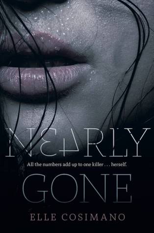
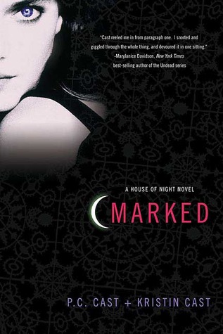
I know we should never judge a book by it's cover, but what's up with...


Arise (Hereafter, #2)
Headless Women

Nearly Gone
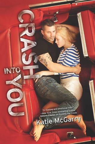
Unnecessary Sexiness

Eleanor and Park
White-Washing

Everneath (Everneath, #1)
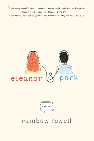
One-Word Titles (AND Headless!)

A Game of Thrones (A Song of Ice and Fire, #1)
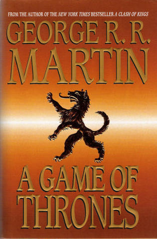
Boring & Non-Nondescript

Marked (House of Night, #1)
Black Like My Tortured Soul

Crash into You (Pushing the Limits, #3)
Cheesy With a Side of Extra Cheese


And Three I Love:
Fahrenheit 451 book design with a match in the cover and a striking surface on the spine.
Clever

beautiful
Understated

Nathaniel Hawthorne's "The Scarlet Letter" - Book Cover Redesign
Simplicity

*Please note that my critique of the cover has no reflection on my feelings regarding content.  

-Kate

No comments:

Post a Comment

Related Posts Plugin for WordPress, Blogger...